
Netizens can’t get enough of Spotify’s colorful visuals. When Spotify users visit the new website “Spotify Pie,” many question how a Spotify Pie Chart functions and how to create one. Then why not? Who wouldn’t be interested in keeping track of music that calms the soul? According to the website’s slogan, “Bake your Monthly Genre Pie,” it’s not difficult to create your own graph. Spotify Pie is a visual representation of the music you’ve listened to in a month and the top artists you’ve listened to, all displayed in a colorful chart. This article discusses the newest trend.
What’s A Spotify Pie Chart?
A few months ago, Spotify Wrapped was released, but fans have already tuned in to a new website that helps them keep track of their music preferences and much more. As the name implies, “Spotify Pie” allows you to analyze your Spotify data, particularly the genres and artists that Spotify users have listened to the most.
But that is not all there is to it. Users of Spotify are salivating over the colorful chart depicting this data. Darren Huang, a UCLA student, is the creative genius behind this website, which truly lives up to its slogan, “Bake your monthly genre pie.”
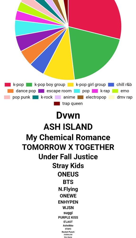
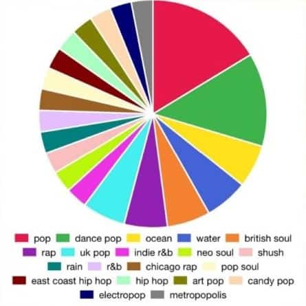
Spotify users can now view how Spotify categorizes each song into specific genres. From “rock,” “metropolis,” and “heavy metal” to “underground hip-hop,” for example, Spotify Pie has you covered. Twitter users can’t stop sharing their colorful desserts, naming their most peculiar musical genres, and judging others’ favorite artists.
Spotify Pie Features
The UCLA student took this tool’s features to an advanced level. This tool is beneficial in every way, from collecting data on Spotify users’ music consumption to generating a pie chart depicting their preferred genres in different colors.
The colors on the viral chart correspond to various genres, with a legend indicating “which color corresponds to which genre.” And Huang did not slack off here; he has included many genres, including post-grunge, album rock, Canadian metal rock, and many more. The legend describes the colors, symbols, and patterns used to depict the data in the chart.
Below the graph legend, users can discover the most frequently listened to artists. The order is from best to worst, allowing you to comprehend your best artists. However, things are about to get even better. In contrast to Spotify Wrapped, the Spotify Pie Chart can be modified monthly, proving the slogan “Bake Your Monthly Genre Pie” to be true.
How To Make A Spotify Pie Chart?
While every piece of this feature sounds intriguing, many people are still pondering how to get a Spotify Pie Chart. It’s not exactly rocket science. The third-party service is accessible through Huang’s website. Interestingly, both mobile and desktop users can access the website for free.
To access your Spotify Pie Chart, you must opt into Spotify and grant the site permission to observe your listening history. After that, a colorful pie chart will be generated. You already know the next step; take a screenshot and showcase it. However, here are a few considerations. This application is incompatible with other streaming services like Apple Music and Tidal.
How Does A Spotify Pie Looks Like?
Since the website’s launch, Spotify users have shared their monthly music history with their peers using this pie chart. And yes, it is a bit more entertaining when friends continue to criticize and tease one another while sharing these colorful graphics.
One individual tweeted his Spotify Pie Chart.
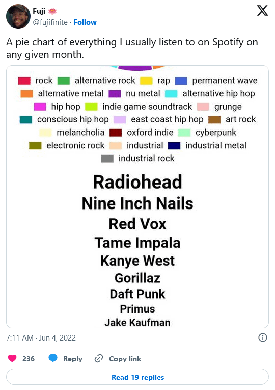
A Twitter user replied, “I guess we are friends now.” Another wrote, “I’m guessing this would change a lot for me from month to month because the stuff at the top is rather recent obsessions.”
Another Twitter user expressed curiosity.
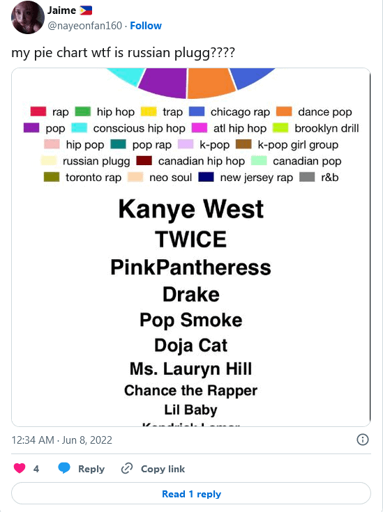
One person sneered, “people really giving away their Spotify accounts.” One user even shared a link to a guide on how to set up your Spotify Pie Chart.
More Places For Spotify Statistics
There are additional third-party websites that analyze and visualize your listening history, even though the Spotify Pie Chart may be the optimal solution. Here are a few examples.